Road to 5 million: the design (part 4)
Context
In the previous post, I chose to code my rental friend platform with Django. This post is about the design of the website.
What makes a good website design?
As you look at my website, depending on your inner values, you might classify it either as having a good or bad design. So, now you should understand, why every piece of visual art (including design) can be very subjective. However, there are objective truths when it comes to website designs. And they are pretty straightforward:
- Have a style theme (aka. same feel) throughout
- Have simple navigation (no nesting)
- The design should be fit for mobile browsing
Style theme
The background has to have contrast with text for easy readability.
Most elements should be structured the same. A paragraph element should be different from a link.
All of this is meant to make your website readable and intuitive.
Simple navigation
Navigation bars should be visible on page load.
Avoid nesting at all costs. If you have deeper links, show them on other pages.
Learn from bad examples - university and government websites.
Mobile browsing
Something something 80% of internet traffic is smartphones...
If your page is not fit for smartphones, your page is dead.
Rental friend platform design
Figma is a good tool for designing website pages.
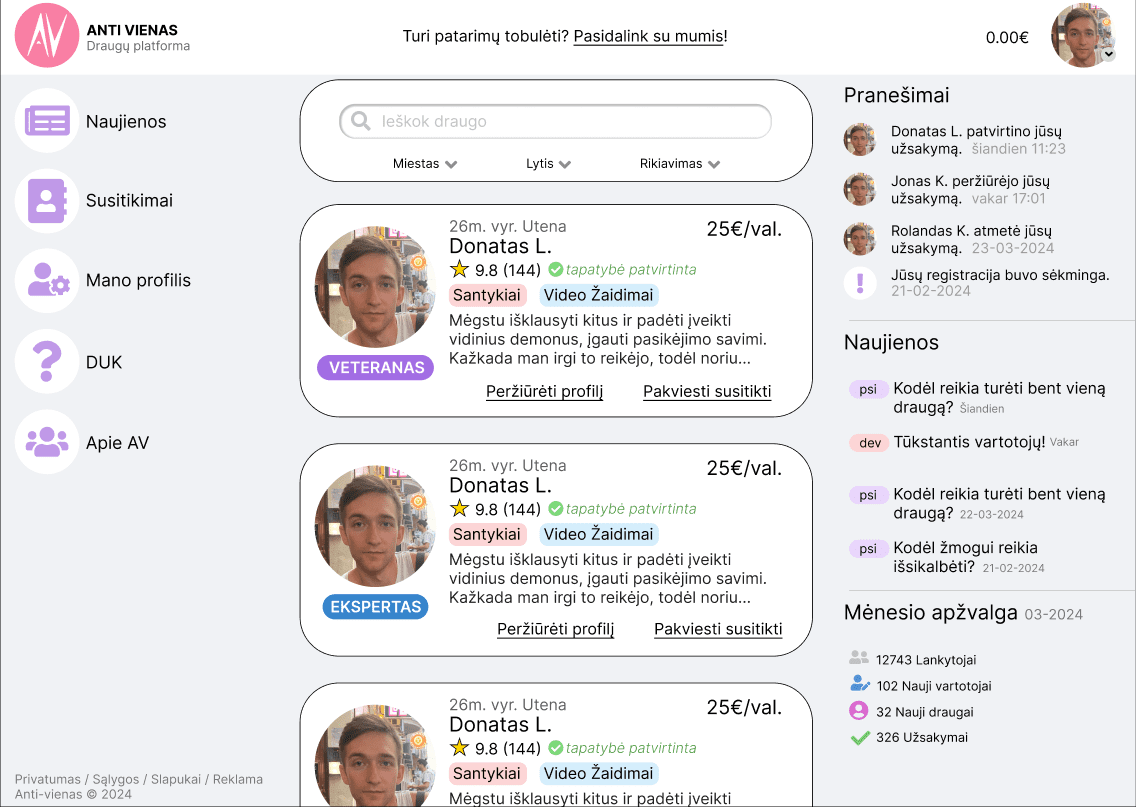
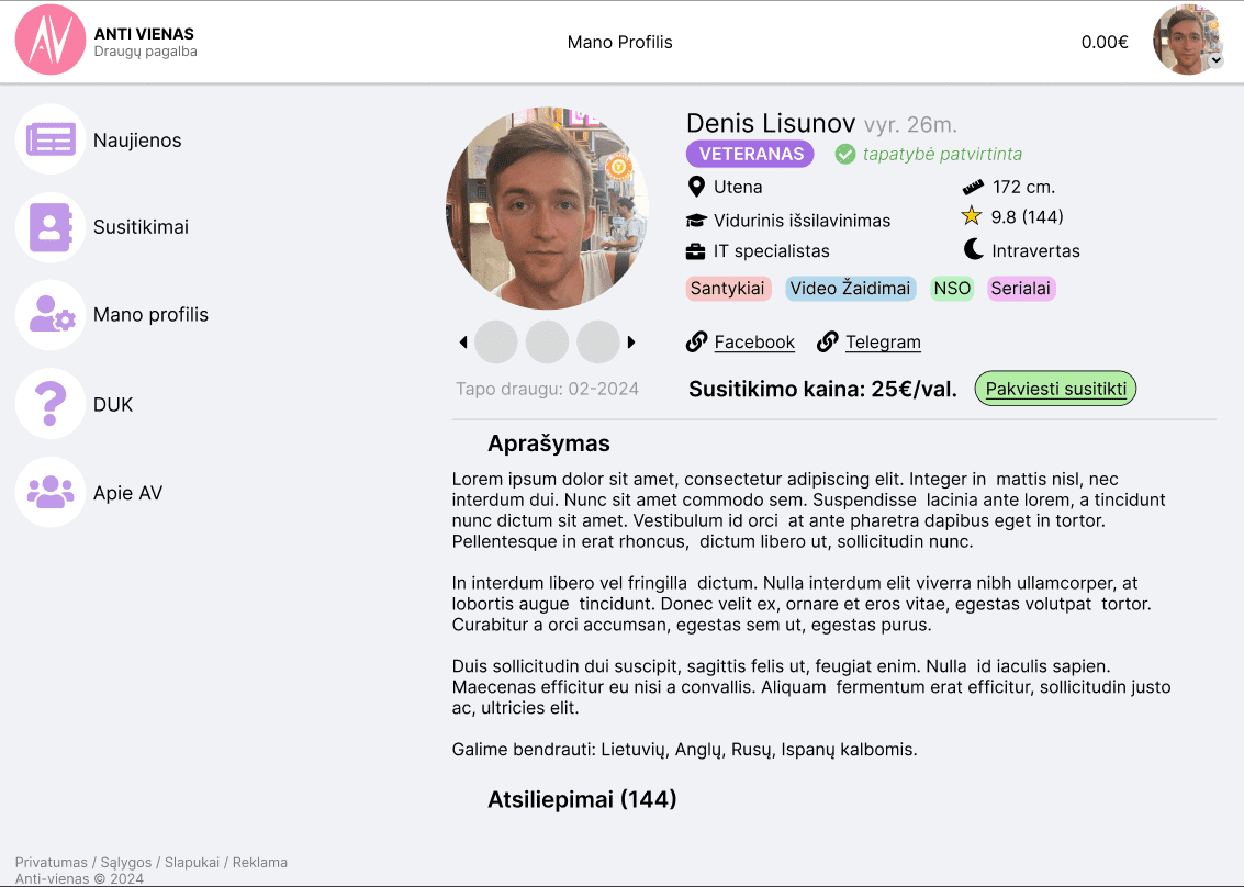
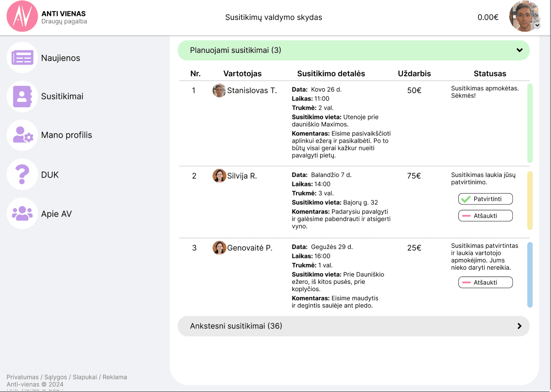
With that in mind, here is the design I made for my platform:


I could go on and design the rest of the pieces. But since there is an established theme, I'm fairly sure I can code the rest. Also, there is no point in designing the mobile version, because it would be faster to just code the responsiveness.
Next part is gonna be nerd shit, and how to code.